Commons:Photography critiques
| SpBot archives all sections tagged with {{Section resolved|1=~~~~}} after 7 days and sections whose most recent comment is older than 90 days. |
Graphics community: Graphic Lab · Graphics Village Pump · Picture Requests · Photography Critiques · Photography terms
 Welcome to the Photography critiques!

Would you like a second opinion before nominating a photograph of yours as a Quality Image, Valued Image or Featured Picture candidate, can't decide which of your images to enter into one of the Photo Challenges? Or do you have specific questions about how to improve your photography or just would like some general feedback?
This is the right page to gather other people's opinions!

If you want general suggestions to a good photo, you can ask here, and we already wrote guidelines.
If you don't get some terminology used here, don't be shy you can ask about it, or read
Please insert new entries at the bottom, and comment on oldest entries first.
To prevent archiving use {{subst:DNAU}}, because SpBot archives all sections after 90 days, unless archiving has been postponed or suppressed through the use of {{subst:DNAU}}. You can ask the bot to archive a section earlier by using {{Section resolved|1=~~~~}} – then it will be archived after 7 days.

Any chances for FP?[edit]
Hi. Recently I took and edited pictures of some utility goods. I know that Featured Pictures must be good of technical quality and be one of the best on Commons. But I have doubts about that "wow factor" – of course, many FP are magnificent (landscapes, monuments, etc.), but I can see a lot of very good images of common things (usually on a white background). I suppose they show objects in an interesting way (e.g. File:2017 Nikon D5500.jpg or File:Electric steam iron.jpg).


Well, that calculator is a common object, but in my humble opinion, it's a very good representation of a modern pocket calculator on Commons (see FP and QI in the Calculators category).
Pictures of the calculator and folding camera are edited (which I marked with the "Retouched picture" template) – I deleted uneven grey background and other things metioned in each file description.
I wonder which picture has a chance for FP. I would be greatful for response :) --LoMit talk 16:21, 23 February 2022 (UTC)
Edit: I added a new image --LoMit talk 14:08, 26 February 2022 (UTC)
- LoMit Sorry that no one has replied so far. I think your photos are very valuable and they have a high potential at COM:VIC if you choose to nominate them there—especially the camera and calculator, which have a very well-defined scope. as for FPC, there's only one way to find out for sure. Even if unsuccessful, you would probably get tips on taking even better photographs in the future. Buidhe (talk) 01:07, 28 February 2022 (UTC)
- Hi, LoMit. I know we already judged the donkey photo. The first three all look like serious FP candidates to me, but I can't predict how people would react to them. I don't think I'd vote for the lamp, but I'd consider voting for at least the calculator. Ikan Kekek (talk) 22:16, 25 April 2022 (UTC)
mashed indoor photographs / Matschfotos bei Innenaufnahmen[edit]
Why do I get such mashed results? exempli gratia / Warum sind die Resultate matschig, z.B.:
_—_Mattes_2022-04-09.jpg)
_Mattes_2022-03-24_Batch_(74).jpg)
OK, it is just a handy camera but I am clueless. / OK, es ist nur ein Handyfotoapparat. Aber trotzdem bin ich etwas ratlos. Wie kann ich das verhindern? --Mateus2019 (talk) 16:57, 10 April 2022 (UTC)
- I'd start with switching HDR mode off. In many cases, that's doing more harm than good. Especially in the second shot, there's no reason to turn it on in the first place, as the painting is lit quite evenly. Cheers, --El Grafo (talk) 08:04, 11 April 2022 (UTC)
- Danke, das probiere ich beim nächsten Mal! --Mateus2019 (talk) 15:33, 11 April 2022 (UTC)
- Na, das gehört aber zu den Basics der Fotografie: Drinnen hast du viel weniger Licht aus draußen. Nicht nur ein bisschen weniger, sondern wirklich viel weniger. Um damit eine angemessene Belichtung zu bekommen, muss entweder lange belichtet werden (halbe Sekunde oder so) mit der Gefahr des Verwackelns, oder die Sensorempfindlichkeit muss raufgesetzt werden. Letzteres wird gemacht. Allerdings wächst mit der Empfindlichkeit auch das Bildrauschen, das hinterher wieder rausgerechnet werden muss, und rausgerechnet wird Rauschen, indem Details zugekleistert werden. (Die Zwischenergebnisse siehst du nicht, nur das Endergebnis.) Auch wenn Handykameras in letzter Zeit viel besser geworden sind: Für ernsthaftes Fotografieren (also wenn du mit den Bildern was anfangen willst – Nachbearbeitung, Vergrößerung, Posterdruck, Gelddamitverdienen) ist ein Handy wirklich nur ein Notbehelf. Tip: Ich verkaufe demnächst meine alte OM-D E-M1, damit machst du auf jeden Fall Faktor 20 bessere Bilder als mit dem Handy :) --Kreuzschnabel 19:44, 26 May 2022 (UTC)
Possible FP?[edit]
Will it be feasible in FP? Not so much for the quality of the photo but for the wow effect. I await your opinion.

(⧼Anna Massini alias PROPOLI87⧽) (talk) 12:24, 5 May 2022 (UTC)PROPOLI87(⧼Anna Massini alias PROPOLI87⧽) (talk) 12:24, 5 May 2022 (UTC)
- I would say probably no. This double rainbow must have been impressive IRL though! Buidhe (talk) 19:25, 5 May 2022 (UTC)
- Pity it’s cut off on both sides. Quality … well, you can’t hide it was a phonecam. I wouldn’t nominate it. Category:Double_rainbows is not that empty after all :) --Kreuzschnabel 21:22, 7 May 2022 (UTC)
- It's a nice picture, but I agree with the others - it undoubtedly had wow in person, but I don't think the photo has enough wow to pass at FPC. -- Ikan Kekek (talk) 05:24, 11 May 2022 (UTC)
Worth trying to apply this photo as QI?[edit]

It has been a while since I posted here in Photo critiques, and I'm wondering if other Commons users think this picture I took back in Aprl is worthy of being a QI candidate. All feedback is welcomed! Tet (talk) 13:54, 4 June 2022 (UTC)
- First: All verticals in the pic are severely leaning to the right, this has to be fixed. Size of 3 megapixels is not overwhelming. Colours seem oversaturated. I’d cut off about 200 pixels from the bottom, the dominating uninteresting foreground makes the main subject appear more distant. --Kreuzschnabel 12:12, 11 June 2022 (UTC)
Possible Valued, Featured, Quality, etc?[edit]
Hi, I took a few pictures and want to know if any of them could be considered for featured, valued, quality, etc. status? Thanks!

1

2

3

4
5

6

7


--Urban Versis 32KB ⚡ (talk | contribs) 14:15, 23 June 2022 (UTC)
- 1: I don’t see a clear composition here. If it was intended to show the entrance, why is that topic squeezed into the left half of the pic? What is the bright block on the upper right? Might be QI though.
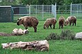
- 2: Pity the lower side of the animal is drowned in shadow. Then, it’s extremely unsharp as if it has been upscaled from a lower resolution (or did you use something called "digital zoom", doing the same thing?). I don’t see much of a chance on QI, and none at all on FP. (That does not mean you’re a poor photographer. It just means this image is not one of the very very best there are on Commons, so there’s still room for improvement!)
- 3. This is sharp at least, but the sharpness is rather on the background fence than on the animal. Autofocus systems do not always guess correctly which object you had in mind to focus. Might be QI though but the animal is rather small, I see no reason to show so much of its surrounding. Try to crop it (at further expense on resolution of course). And don’t upscale it by any means!
- 4. Same unsharpness as #2, maybe even worse. Apart from that, did you notice the tree to "grow out of" the zebra’s back? Issues like this don’t improve composition. Besides that, I’d prefer to pan the camera a bit to the right to get more "leading room" at the head end. The moose in the background makes a nice counterpoint, nicer than the root on the left foreground which is not needed here.
- 5. Your camera set the focus to the log covering the leftmost animal’s feet. This animal is still nearly sharp, the other ones are hardly usable. I can see an idea of composition here, but the feet being covered will prevent a feature (even if it weren’t for the focus issue).
- 6. Unsharp. Simply unsharp. Good idea but something went wrong. Keep it if there’s something personal linked to it, I’d toss it in the bin.
- 7. Same. The only sharp spot of the star is the rightmost tip (or is it called a point, or a corner?). In closeup photography, depth of field is often an issue, and it is here. Nearly impossible to get a closeup image from a simple point-and-shoot camera featured. To get all of it sharp, you either have to stop down the aperture, or do a focus stacking (i.e. take multiple exposures with shifting focus, then compose the sharp areas into the final image).
And when it comes to VI nomination, it depends on the range you would like to set your image in. It has to be the best within a certain range given.
All in all I think you should keep your eyes open for better camera gear. Don’t need to be a full-frame SLR – a used Olympus OM-D (the early ones of 2013 go rather cheap) with a decent lens (or set of) will make your photos leap several levels up in quality.
--Kreuzschnabel 20:53, 24 June 2022 (UTC)
- My brief evaluations: 1. Might be a QI. 3. The goat looks sharp enough, but you'll get objections about slanted pillars at QIC. 4. As Kreuzschnabel said. 5. I'd suggest cropping out the very blurry log in the left foreground if you want to nominate the photo at QIC. It might pass. 6. Blurry even as a thumbnail. 7. Unsharp. -- Ikan Kekek (talk) 20:53, 25 June 2022 (UTC)
What's the issue?[edit]

Repairs of Saint-Antoine l'Abbaye church, June 2022

Hi, This was twice nominated for QI, and still not reviewed. What's the issue? Thanks, Yann (talk) 09:05, 5 July 2022 (UTC)
- It hasn’t been declined either, it’s still waiting for review. Be patient – nominating twice (resulting in two open nominations) does not help. The review process is being done by volunteers in their spare time as well. So far, nobody seems to be overwhelmed by your pic. --Kreuzschnabel 17:54, 5 July 2022 (UTC)
- The right side is not straight. It also looks a bit blurry, I think that f/6.3 is not ideal and F should be higher to make everything in focus. Podzemnik (talk) 00:44, 7 July 2022 (UTC)
Are these images qualified for QI?[edit]
I'm rather new towards photography and I've been trying to sharpen my skills. I've taken a load of photographs over the course of a few days, and I've gathered a number of photographs which I deemed to be satisfactory, for me at least. I wondered, are these photographs eligible for QI?
_1.jpg/120px-Bank_Negara_(Penang_Branch)_1.jpg)
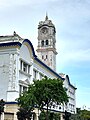
Central Bank of Malaysia, Penang Branch.

Lim Lean Teng Mansions.
Malayan Railway Building.

Church Street, George Town.

Beach Street, George Town.
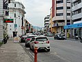
Beach Street, George Town (alternative).
_1.jpg)


Thanks in advance. Cheers, PenangLion (talk) 13:33, 11 July 2022 (UTC)
 Comment I would not support the images. All images show blurring noise reduction combined with sharpening artifacts. --Smial (talk) 13:51, 12 July 2022 (UTC)
- Thank you for the comments. PenangLion (talk) 06:57, 19 July 2022 (UTC)
- Comment I haven’t looked at all of them, but as for #1, you just cannot hide it was a phone cam. There’s this "watercolour look" on the details, caused by heavy noise reduction applied automatically. #4 is unsharp and has been sharpened digitally, making those bright seams along all edges. Leaning-in verticals (caused by pointing the camera upwards, can be corrected afterwards on the expense of resolution) are a minus. --Kreuzschnabel 06:39, 15 July 2022 (UTC)
- Thank you for the comment. PenangLion (talk) 06:58, 19 July 2022 (UTC)
Good enough or is retake necessary[edit]
Hello, I have access to $3,000 pump for some time and I figured I could photograph it while it's in my office. I took a picture of it on my floor, but I could take another picture of it on a drafting table (dirty, light green background). Would that be better?

Steam powered sump pump

Ivangiesen (talk) 14:15, 18 July 2022 (UTC)
- My non-expert take is it would be better on the table, or some backdrop that's a different color from what you're photographing. I'd also try for softer light if possible because there are some areas on the pump that look "burned". Buidhe (talk) 16:17, 18 July 2022 (UTC)